Driving Patient Adoption
Diagnosing why patients abandoned Pfizer’s support app before it could help them
Pfizer · via HawkPartners · 2022
Summary
Pfizer built the Amba app to support people through treatment for metastatic breast cancer — yet after its pilot, patients were dropping off before they ever reached its value. I led the research to diagnose why, designing a study that recreated the full adoption journey — the pharmacy call that first offered the app, account set-up, and a week of real use — rather than testing screens in isolation. Patients, it turned out, weren’t rejecting Amba; the experience was asking for their trust before it had earned any. Repositioning the value and clearing the onboarding friction reversed the trend, lifting account creation, active use, and session length.
01 Context
Aug 2022
Aug 2022
Sept 2022
Sept 2022
Sept 2022
Oct 2022
How patients got the app. Amba was offered to patients starting IBRANCE, a treatment for metastatic breast cancer. Eligible patients received the app through their specialty pharmacy: if they opted in during a phone call with a pharmacist, they were given an invite code to download it and set up an account.
Inside, the product was strong. Amba offered reminders for a medication with a demanding 28-day dosing cycle, lab appointment reminders, disease and treatment education, symptom and side-effect tracking, wellness goals, and a digital coach to tie it together. It was designed to be the one place a patient could manage a treatment that had just become a significant part of their daily life.
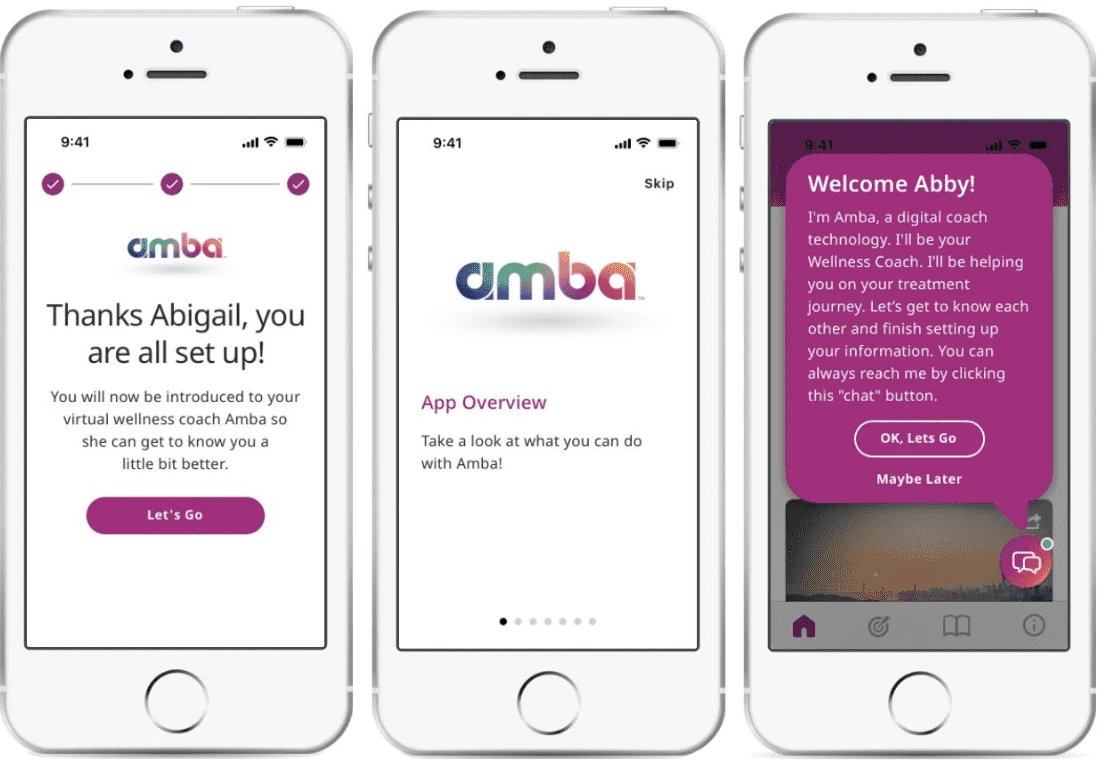
The end of onboarding — set-up confirmed, a brief app overview, then the digital coach introduces itself. How early that overview appeared turned out to matter a great deal.
02 Problem
Engagement fell short at every stage. After the pilot it came in well below expectations. Downloads missed targets. Of the patients who downloaded, fewer created accounts than expected. Of those who created accounts, in-app activity was limited and ongoing use thinner still. With a national rollout ahead, Pfizer needed to know what was actually wrong.
The hard part was that the drop-off pattern was consistent with almost any explanation, and each one implied a completely different fix:
- Was it the value proposition? Maybe patients didn’t understand or want what Amba offered.
- Was it the channel and timing? Maybe a pharmacy phone call was the wrong moment to make the offer.
- Was it trust? Maybe a pharma-sponsored app asking for health data raised questions patients weren’t comfortable with.
- Was it onboarding friction? Maybe patients wanted it and simply couldn’t get through set-up.
- Or was it the features themselves? Maybe the product needed to be rebuilt.
Analytics could not say why. They showed where patients stopped, but not the reason — and the difference mattered enormously. Rebuilding features is a very different investment than rewriting a pharmacist’s script.
03 Solution
The core research decision was to study the journey, not just the interface. Testing screens would only have answered whether the app was usable — a question that couldn’t distinguish between “this product has no value” and “patients never get far enough to see its value.” So I designed a study that recreated the whole adoption path, in order, as a patient would actually live it.
Fifteen metastatic breast cancer patients taking IBRANCE — recruited through a screener I built for treatment stage, time since starting IBRANCE, and specialty pharmacy relationship — each went through a 45-minute session that I moderated, then a week of independent use:
- A simulated pharmacy offer call, using the real script patients would hear, so I could watch the decision to opt in as it actually happens.
- A live account set-up walkthrough — invite code, date-of-birth validation, consents, legal agreements, account creation — observed in real time rather than recalled afterward.
- Five in-app activities over the following week — unmoderated, completed on their own time after the session — covering the coach conversation, IBRANCE education, the homepage, a symptom check-in, and wellness goals, then a 14-question follow-up survey.
Each stage of the study recreated a stage of the real path — so a drop-off could be traced rather than guessed at
The unmoderated week broke it open. That last stage was the one that mattered most. By letting patients live with the app after the first impression, I could separate a bad onboarding experience from a bad product.
The evidence started early. It was consistent throughout: 13 of 15 were interested from the pharmacist’s description alone. Medication and lab reminders were the standout draw, made genuinely useful rather than nice to have by the demands of a 28-day dosing cycle. After a week of real use, 12 of 15 said they would be somewhat or very likely to download and use Amba if it were offered to them. The majority of patients who said they would use it would keep going for as long as they were on IBRANCE. The product didn’t need to be reinvented. Patients needed to reach its value faster, and with fewer reasons to doubt it.
“There are too many hoops for Amba upfront, and I don’t even know what it offers.”— study participant
Mapping feedback across the journey, five barriers stood between the offer and that value:
| What I found | What it meant for the product |
|---|---|
| Patients were overwhelmed before the app entered the picture. The first-prescription call is a moment of cognitive and emotional overload — even a helpful app can land as one more thing. | Stop treating the first call as the only ask. Reintroduce Amba on later calls and offer lower-pressure entry points. |
| “Wellness coach” didn’t explain anything. Patients were intrigued but couldn’t say what Amba actually was, and the strongest features weren’t mentioned early. “What’s a wellness coach? I’m not well.” | Lead with the concrete: medication and lab reminders, education, resources, symptom tracking. |
| “Not a live person” triggered skepticism. Framing a chatbot as the headline feature raised flags for patients who wanted human support. | Reposition the coach as one layer of a support hub — and clarify when a real person is reachable. |
| Trust questions arrived before value did. Pfizer sponsorship, data sharing, legal agreements, and a 12-month program window prompted patients to ask who the product was really for. “Are we helping the patient or are we helping Pfizer?” | Explain Pfizer’s role plainly, show value before asks, and give patients visible control. |
| One screen was quietly costing accounts. Date-of-birth validation required scrolling to a birth year with no clear completion state — enough friction that some would abandon or delete the app. “There’s no ‘done’ button. Very complicated — would not even bother doing this and would delete the app.” | Replace it with standard mm/dd/yyyy entry and an unmistakable completion state. |
Five barriers between the offer and the value — and what each one implied
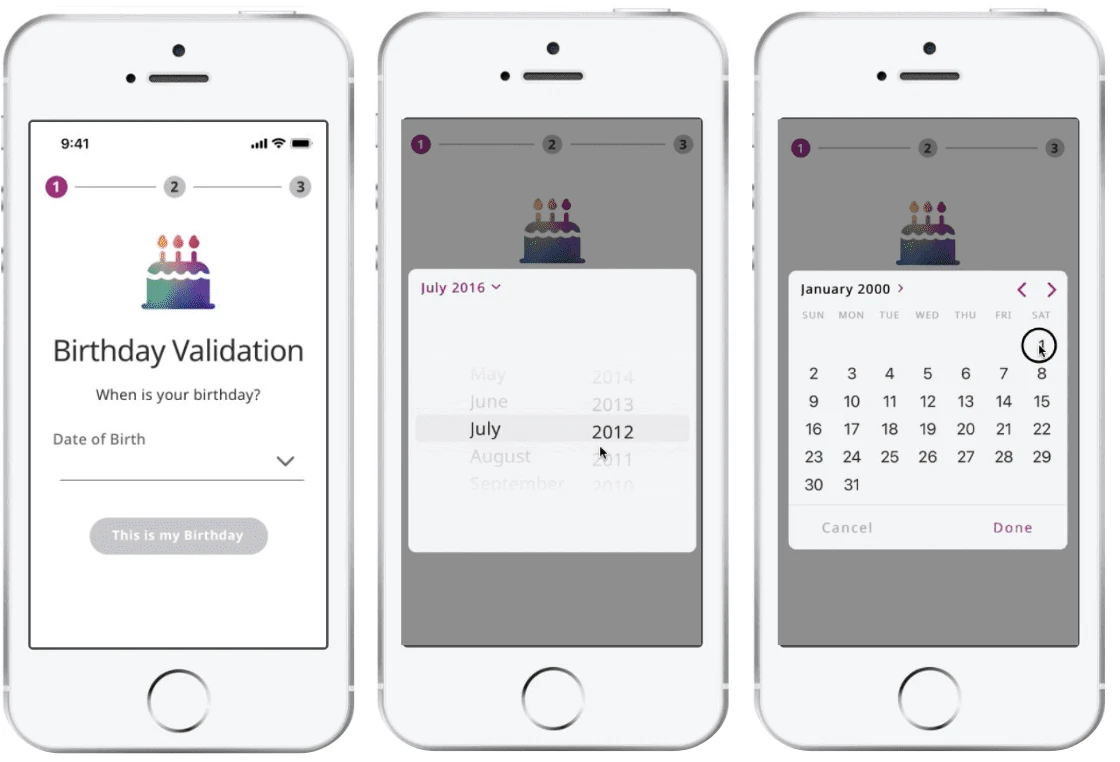
The clearest example: confirming a birthday took three screens, required scrolling to a birth year, and left patients unsure how to finish — some said they’d have deleted the app rather than persist
Turning that into direction. The recommendations I brought to Pfizer’s product, CX, and marketing stakeholders worked on three levels — because fixing only the screens would have left the real problem untouched. Where the fix was language, I wrote it: the report delivered a full replacement script for the pharmacy call, annotated against each barrier it was built to remove.
| Layer | Recommendations |
|---|---|
| Adoption context: the offer outside the app | Reintroduce on second and third pharmacy calls; add lower-pressure materials; rewrite the value proposition around concrete treatment support |
| Trust & motivation: earning the right to ask | Move the app overview before the legal asks; explain Pfizer’s role and data use in plain language; clarify SMS purpose, frequency, and opt-out; address the 12-month question |
| UX execution: clearing what gets in the way | Rebuild date-of-birth entry; resequence onboarding screens; humanize consent copy where compliant; surface reminders and education earlier |
Recommendations spanned the journey — timing and messaging, trust, then interface
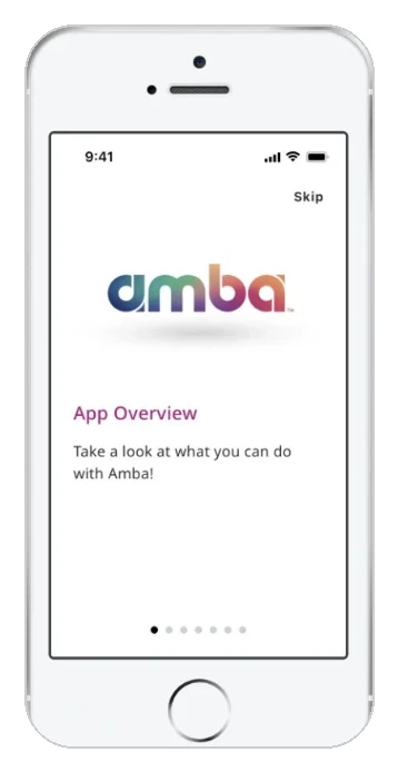
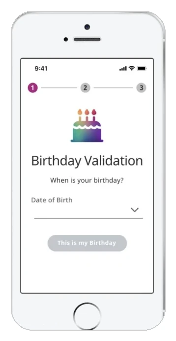
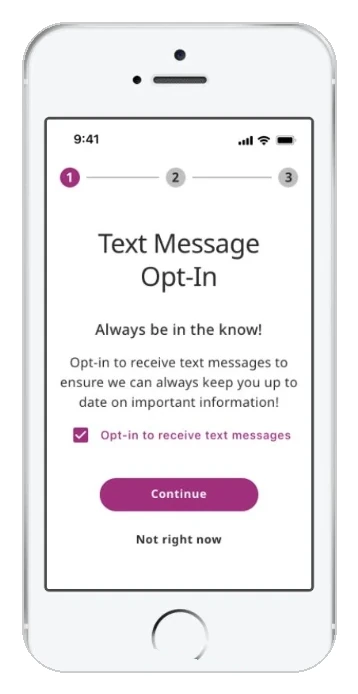
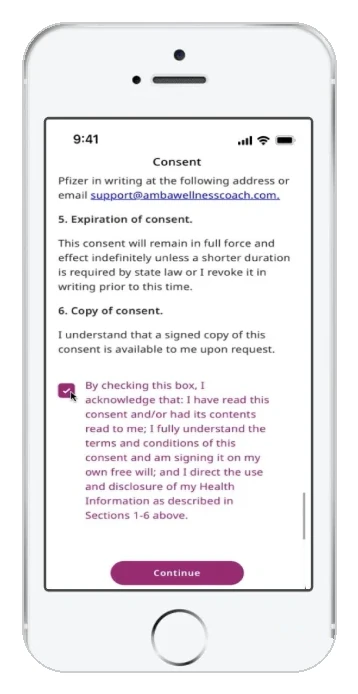
What that meant screen by screen — the account set-up recommendations as delivered to the product team
Working inside real constraints. Not every patient-friendly idea survives contact with pharma legal and regulatory review, and some of the clearest language we could write simply wasn’t permissible. I framed recommendations as directions to evaluate with legal and regulatory partners rather than finished copy — which is what made them usable to the team instead of aspirational.
04 Outcome
Pfizer implemented UX and positioning changes based on the study ahead of the wider rollout. Following implementation, the team reported improvement across all three engagement metrics that had prompted the research:
| Engagement metric | Reported change |
|---|---|
| New account creation | +30% |
| Active user rate | +12% |
| Average session length | +28% |
Figures as reported by the client team following implementation of the study’s recommendations. An observational before/after comparison, not a controlled experiment — the research informed the changes associated with these lifts rather than being their sole cause.
Where the lift landed. It matters as much as its size. Account creation moved most, which is exactly what the diagnosis predicted: the biggest barriers sat before patients ever reached the product. Session length rising alongside it supported the core finding — patients who got in were engaging more deeply, because the value had been there all along.
What it led to. The engagement earned continued trust with Pfizer’s digital product teams, leading to further research and strategy work.
What I took from it. In healthcare, adoption depends as much on trust, timing, and context as on usability. The most valuable work I did on this project wasn’t evaluating an interface — it was insisting that we study the moments around the screen, because that’s where the product was actually losing people. If I ran it again today, I’d push to prototype the revised onboarding sequence and test it head-to-head against the original, so we could prove the trust and completion gains before full implementation rather than after.