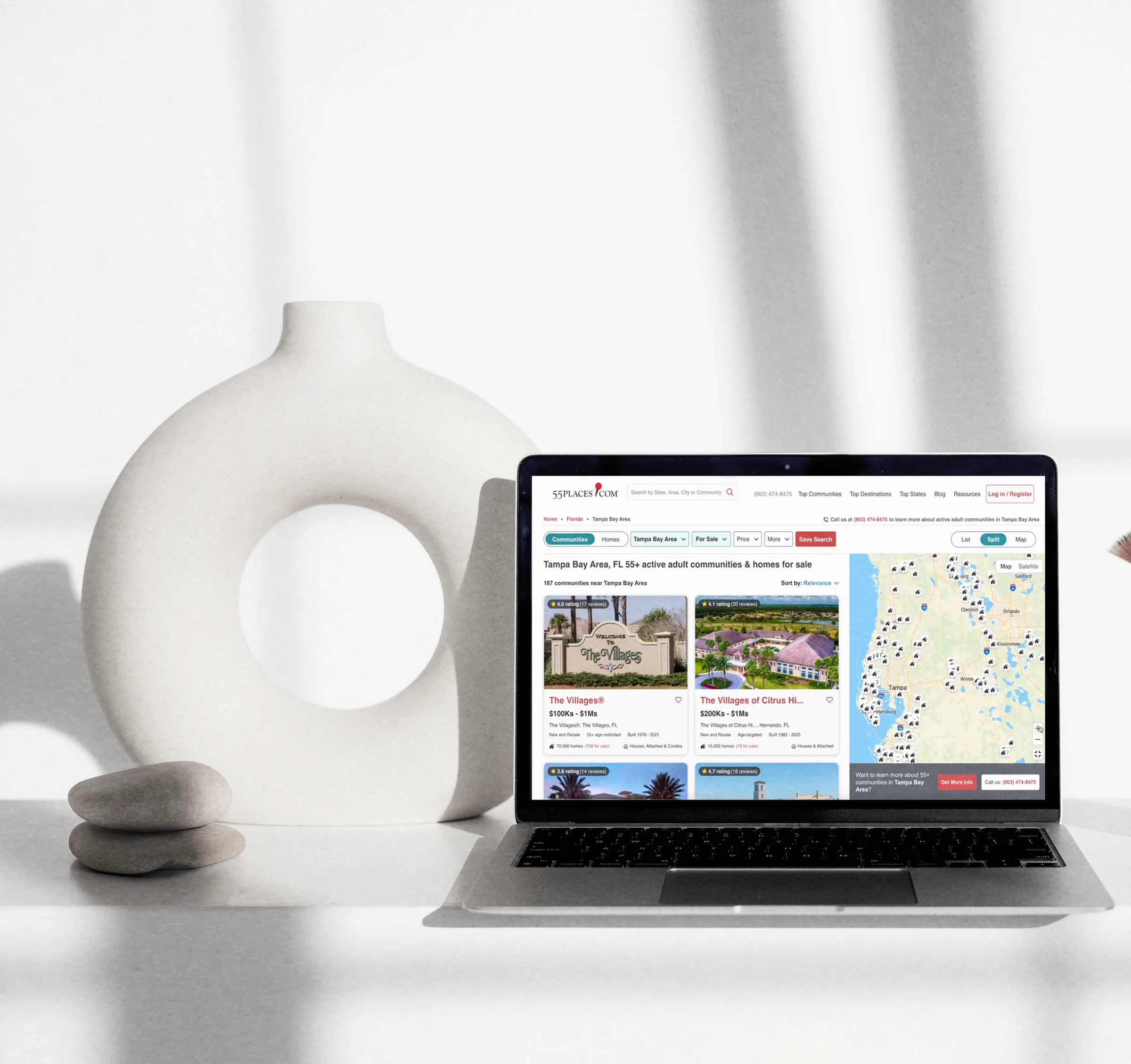
Rebuilding Discovery
Transforming 55places’ core experience from a nested directory into a dynamic marketplace
55places · 2024–25
Summary
55places is a national marketplace for 55+ communities and homes — but its core discovery journey still behaved like a directory, making people click through geographic pages one community at a time. I led the research and end-to-end design that rebuilt it into a dynamic search experience: communities and active homes in one filterable interface, tied to a live, synchronized map. Qualified-lead conversion rose 20%, saves per session more than that. The structural change mattered more: breaking the one-page-per-location model turned discovery into a composable surface, so 55places can now build a results page around any query — from on-site search to Google to an AI assistant.
01 Context
Sept–Oct 2024
Nov 2024
Dec 2024
Jan 2025
Feb–Mar 2025
Apr 2025
May 2025
Buying is a months-long decision. People arrive at every stage of it. Some already know the community they want; others are comparing cities, climates, prices, amenities, and hundreds of communities across several states.
Roughly 1,700 pages carried that traffic. Geographic destination pages were the primary bridge between broad exploration and the detailed community information that made 55places valuable — one for every state, area, and city the company covered. They were among the site’s most important organic-search landing pages, and more than one in five sessions touched one. That structure was already in place when I joined 55places in the fall of 2024 — an information architecture closer to a publishing site than a real estate marketplace. A user might start on a state page, choose an area, navigate to a city, scroll through editorial content, then open communities one at a time.
From a content-led directory to an interactive search destination
02 Problem
A foundational study, run end to end. The problem came out of research conducted across September and October 2024 — the first large-scale qualitative user study the company had run, and one I designed, managed, and executed myself. It was scoped to three questions: what users want to see and do on 55places, where navigation and usability break down, and what pushes people out of the ecosystem mid-search. Fifteen one-hour semi-structured interviews — eight current users, three past, four prospective; nine on desktop, six on mobile — each dropping the participant onto a live page and following their real search behavior before testing concepts against it. The study spanned five page types and five hypothesis areas across the site; the destination-page findings are the slice that drove this redesign.
The tension it surfaced. Users saw 55places as a trusted, uniquely valuable resource for researching 55+ communities, but when they were ready to narrow their options, the experience felt far more manual than Zillow and Realtor.com, the products setting their expectations. Four core problems stood out:
- Search required too much manual work. Users began with specific criteria — location, home type, price, pet policies, accessibility, proximity to healthcare — but couldn't apply them across the experience. They opened communities one by one, only to discover an option didn't meet a key requirement.
- Geography was critical, but the map was hard to use. Location was one of the biggest decision factors, yet the map sat apart from the results and felt unresponsive. Some users left for Google Maps to understand proximity — “I would just Google Map it… this way I know how far it is to the airport.”
- The page structure interrupted exploration. On desktop, a lead form appeared after the first two results — many participants, new and returning alike, read it as the end of the list and assumed only two communities existed. On mobile, filters were easy to miss and long content delayed the results.
- The product stopped at communities. Users could research communities but couldn't browse the homes within a destination, pushing them to Zillow or Realtor.com to continue.
“This just seems like you have to pick a place and then look at it, and then pick another place and look at it… it is kind of daunting, especially for places like Arizona and Florida where there’s like a gazillion different communities.”— past user, desktop
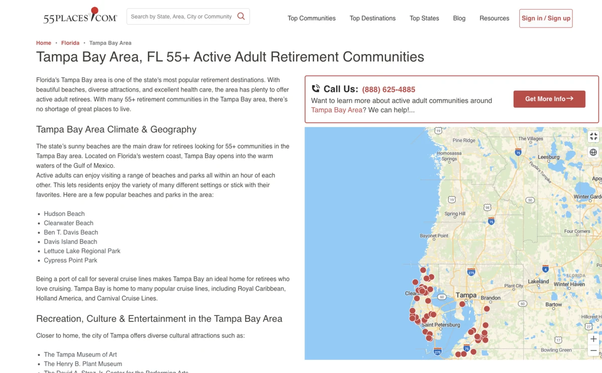
Before — the map lived apart from results (desktop), and split into separate modes on mobile
03 Solution
Reorganized around the real task. I built the experience around what users were actually trying to do: evaluate the available options in a location. Search and inventory became the primary experience; educational and market content stayed available, but no longer stood between users and the results they came to explore. Four decisions did most of the work.
1. Communities and homes in one journey. For the first time on 55places, users could browse both communities and individual homes from a destination. A prominent Communities–Homes toggle supported two mental models — communities for comparing lifestyle and fit, homes for evaluating active inventory.
2. A persistent, synchronized map. The map became an interactive part of the search surface rather than a separate destination. On desktop, users could choose list, split, or full-map views, with cards and markers synced so interacting with one clarified the other. The map also revealed detail progressively by zoom — named community markers at broad views, then homes and price markers up close — reducing clutter while keeping detail when it mattered.
3. Filtering at the point of decision. A persistent filtering system let users refine communities or homes without leaving the page. On mobile, filters opened in a dedicated full-screen flow with an explicit result count and apply action.
4. A lead form that no longer ended the list. The form that had convinced people there were only two communities became an inline card, mixed into the results every six cards and opening into a modal when tapped. It stopped reading as the bottom of the page, and as a form it became both easier to find and easier to use.
After — the map drives the search: results track the viewport, and detail resolves as you zoom in
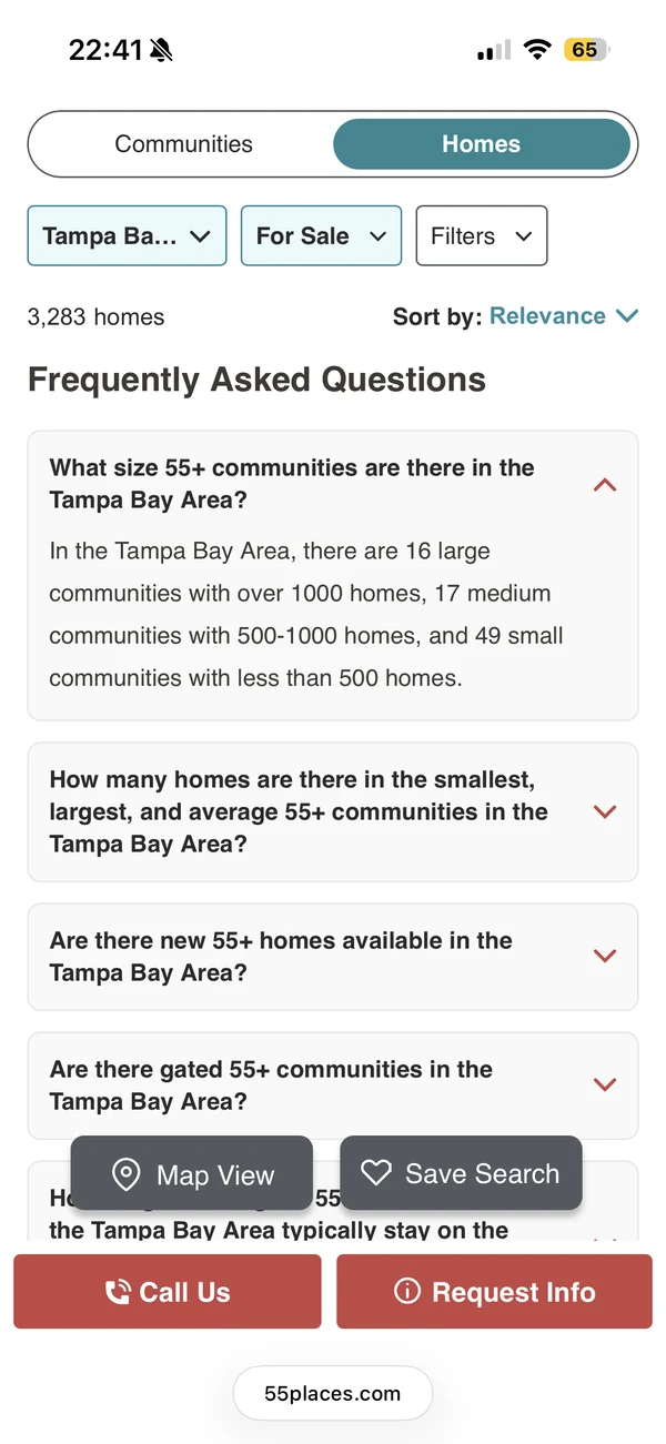
Mobile — filters open full-screen, counting results live on the apply button; inventory, switching, sorting and saving stay up top
Working under real constraints. The redesign touched search, geographic data, inventory, content systems, responsive layouts, lead generation, analytics, and SEO. When frontend capacity tightened, I worked with product and engineering to protect the core discovery journey — deferring or simplifying lower-priority content modules so the team could concentrate on maps, cards, filters, views, and responsive behavior.
Validating the model. In January 2025 I ran four moderated prototype sessions on Lookback — three desktop, one mobile — with product and executive stakeholders observing live and feeding questions into the room. Participants consistently described the new experience as more intuitive, more visually appealing, and easier to navigate than the existing site, and the sessions surfaced a detailed punch list I worked through before build. Not every request became a change — several were worth more as documented decisions than as features.
| What testing surfaced | What I did |
|---|---|
| Home-price pins helped up close but cluttered broad views | Tied pin detail to zoom instead of adding a control — communities while users are still comparing areas, homes and prices once they’ve narrowed to one. Detail follows intent, so nobody has to manage a setting |
| Asked directly, users couldn’t always say what a given pin meant — though they navigated the map comfortably without knowing | Declined the suggested legend. Pins now explain themselves on hover and click — dots resolve into price pins, icons into named communities. A legend would have parked a permanent control over the most space-constrained surface on the page to answer a question users only had when asked |
| Age-restriction wording confused users and didn’t match the filters | Renamed to “55+ age-targeted” and “55+ age-restricted” and matched it across cards, filters, and tooltips. This was also the most common confusion in the foundational study — two studies landing on the same word made it a vocabulary problem, not a UI one, so the fix had to be systemwide |
| Ratings lacked context | Added review counts, and an explicit “No reviews yet” rather than hiding the absence. Trust is the reason users pick 55places over Zillow — a rating with no denominator spends that advantage to look better |
| One participant wanted the filter list alphabetized, and a global Reset All | Declined both. Alphabetizing would have replaced an ordering derived from National Housing Survey data with an arbitrary one, and a reset button would have cost bed and bath — two of the most-used filters — their place in the bar to serve a much rarer action |
| Asked whether gated-community status belonged on the cards, users said it would be useful | Declined. It surfaced only when I raised it; unprompted, the same users called the card comprehensive. Adding it meant demoting something they had volunteered as useful to make room for something they had merely agreed to |
A sample of prototype feedback, and what shipped — including what I chose not to change
04 Outcome
What shipped. The redesigned experience launched across desktop and mobile on April 28, 2025. For the first time, users could explore communities and active homes together, refine without leaving the page, compare results against a responsive map, save options, and move fluidly between broad geographic exploration and specific inventory.
How it was measured. The data team compared equal 15-day periods before and after launch for sessions that included a destination-page visit. Because the after period had more traffic, the most defensible comparisons normalize by session volume:
| Metric (per session) | Before | After | Change |
|---|---|---|---|
| SQL conversion rate | 0.35% | 0.42% | +20% |
| Community saves | 0.88% | 1.07% | +22% |
| Property saves | 0.53% | 0.64% | +21% |
| Lead-start → success completion | 37.6% | 43.6% | +16% |
| MQL conversions | 0.60% | 0.67% | +11% |
| Phone clicks | 0.77% | 0.86% | +11% |
| Average session duration | 507s | 526s | +4% |
Method: equal 15-day windows before and after the April 28, 2025 launch, for sessions containing a destination-page visit. An observational before/after comparison, not a randomized experiment.
What it unlocked. The old model bound one page to one location — each destination a separate, largely static document, and a ceiling on what search could ever become. Rebuilding discovery as a dynamic, filterable surface removed that constraint: a results page no longer has to correspond to a place. It can be composed from any combination of geography, inventory type, price, and amenities, which is what makes personalized, intent-specific results pages possible at all. 55places can now assemble a page around the query itself — whether the visitor arrives through on-site search, a search engine, or an LLM-driven assistant. That is no longer hypothetical: the same surface now powers dynamic Explore pages generated from arbitrary search queries, with geography matched to the map and list, keywords mapped onto the filter set and pre-applied, and the Communities–Homes toggle set to whichever the query implied. The same structure that made results easier for people to explore made them far more legible to crawlers and answer engines, strengthening organic reach alongside the in-session gains above.
The structural change underneath the redesign — hundreds of fixed pages replaced by one page composed from the query
What I took from it. This was my third project after joining 55places, and the first time I argued for replacing a core model rather than improving the pages built on top of it. What won the argument wasn’t a critique of the old structure — it was showing what the business could do once a results page no longer had to be a place.